Painting How To
Zorn Limited Palette
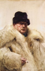
The Zorn limited palette is named after renowned Swedish artist Anders Leonard Zorn (February 18, 1860 – August 22, 1920). Best known for his portraits, domestic scenes, and nudes in outdoor settings, he, like John Singer Sargent and Joaquín Sorolla, is greatly admired by many realist artists today for his lively and skillful brushwork.
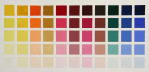
Zorn’s signature technique lies in his limited palette, which consists of just four colors. While there may be slight variations in the exact colors, it is generally accepted that Zorn reduced his palette to the earthy hues of Yellow Ochre, Cadmium Red Medium, Ivory Black, and White. Some lists include Vermilion, Viridian, and/or Cerulean Blue. Regardless of the exact colors, the palette’s limited color range sets it apart from the more extensive palettes used by many artists in contemporary times.
Why use a limited palette?
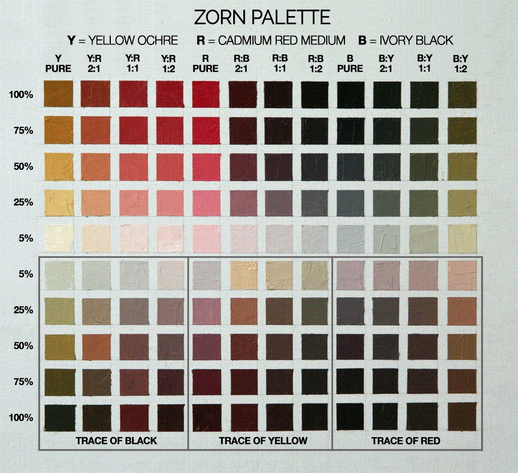
Curious about what happens when you work with a bare-bones palette, I tried a little exercise borrowed from Alla Prima II: Everything I Know about Painting–And More by Richard Schmid. I created a color chart using the basic Zorn palette of Yellow Ochre, Cadmium Red Medium, Ivory Black, and Titanium White.
Learning Zorn’s limited palette helped me develop a more refined color sense, avoid overmixing, and achieve visual harmony and a pleasing sense of unity across the painting. Also, by limiting color options, I learned to pay closer attention to tonal values, drawing accuracy, and the composition of the painting which quickly improved my painting.
Instructions for creating a Zorn limited palette grid
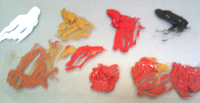
This exercise involves creating a color chart where the basic Zorn limited palette of Yellow Ochre, Cadmium Red, and Ivory Black are systematically mixed from fully saturated hue to barely tinted white. The resulting chart demonstrates the remarkable range of colors you can get from this basic palette. I also discovered the beautifully harmonious color combinations that are created by using this palette.
MATERIALS
These are the materials that I used for this exercise. Investing in professional-quality oil paints and tools is always worth it. M. Graham is my favorite brand of oil paints and medium. I explain why in my post, “Why I Love m Graham Oil Paints”.
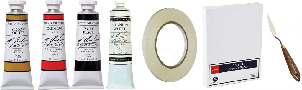
M Graham Paints
Yellow Ochre 1.5oz
Cadmium Red 1.5oz
Ivory Black 1.5oz
Titanium White Fast Dry 5oz. – 5oz will be very useful as you continue painting.
Canvas, Tape, and Palette Knife
Canvas Panel 12×16 inch 3-Pack
1/4-inch Artist Tape
Palette Knife
Other useful studio materials
Walnut Alkyd Medium – Speeds paint drying time. Mix only in a few drops into small puddle of paint.
Nitrite Gloves – Protection against heavy metals used in cadmium pigments
Turpenoid Natural – Non-toxic solvent for cleaning brushes and palette
The Master’s Brush Cleaner – For cleaning and restoring brushes and spot cleaning fabrics.
Full Disclosure: The items on this list link to Amazon. If you buy products from a link, I receive a very small commission.
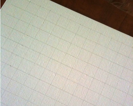 STEP 1: Draw the Grid
On a 16-inch x 12-inch canvas panel, draw a grid of 1-inch squares, 12 across and 10 down.
 STEP 2: Mask the Grid
Using house painter’s masking tape cut into 1/4 inch wide strips, mask the edges of the 10 rows and 12 columns, creating squares in which mixed colors will go.
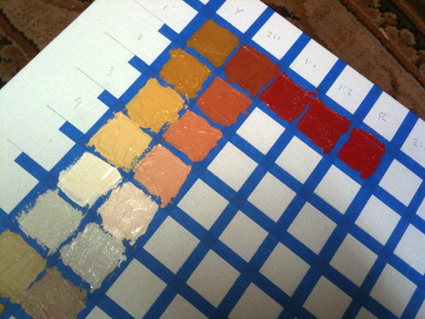 STEP 3: Mixing and Painting the Grid
This is where the fun begins!
Using a small palette knife or brush, paint the grid with the colors mixed as follows.
Top Row:
Colors straight out of the tube in columns 1, 5, and 9. The other mixed colors establish a base of secondary colors (oranges, purples, and greens), by mixing sets of two primaries each – Yellow & Red; Red & Black; Black & Yellow – in the ratios noted on the Zorn limited palette chart. Do not add white to the first row.
Next Four Rows:
Mix white with the color at the top of each column. Your goal is to create a 5-stage progressively lighter value of each top row color. Listed on the left side of the guide is the approximate percentage of the top row color mixed with pure white for each row. Try to create a gradual but clear series from the pure color to a light tint of that same color.
Bottom Five Rows:
Here you explore the tertiary colors. When using this limited palette, the tertiary colors are mostly in the brown to pink family. You will also discover some lovely flesh tones. The progression is the same as the upper grid but with the addition of a third color. In this exercise, you will be adding the third color mix. For example, in the columns where Yellow Ochre and Red were mixed, add a trace of Ivory Black. Carefully mix in a little pigment at a time – just enough color to see a shift in hue. You should also see the color’s temperature shifting as the third color is added.
TIPS
Mix One Column At A Time
Begin by mixing a large puddle of pure colors and dividing it into five smaller puddles. Next, add white to each puddle to gradually lighten the colors. Once the colors are painted on the grid, add the third, trace color, to each mixture and use it in the lower half of the column.
Keep Your Palette and Colors Clean
After completing each column, clean your palette, brush, or palette knife to maintain the purity of your colors.
FAVORITE BOOKS
Great instruction and wonderful inspiration for all level.
 Alla Prima II Everything I Know about Painting by Richard Schmid
This is my painting artist’s Bible. Icon Richard Schmid shares his wisdom and technical savvy, which came from a classical education and a lifetime of painting and teaching. The supreme alla prima master, Richard gracefully leads his reader through the subtleties of painting theory and technique with refreshing directness and unmatched technical authority. Richard's insights and lessons are not just valuable for alla prima painting, but for all styles.
Learn More
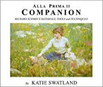 Alla Prima II Companion: Richard Schmid's Materials, Tools and Techniques
Richard Schmid's Materials, Tools and Techniques - By Katie Swatland. The path to creating great works of art begins with knowing the capabilities of your materials and tools.Contained within the pages of this book are detailed descriptions of the processes that go into the creation of a painting.
Learn More
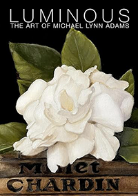 Luminous: The Art of Michael Lynn Adams
Painter Michael Lynn Adams explores how his childhood nurtured his artistic curiosity and shares methods for creating luminous works, illustrated with over 95 paintings and drawings.
Learn More
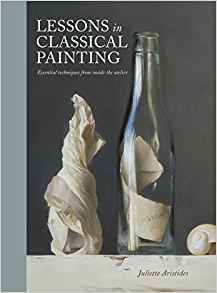 Lessons in Classical Painting: Essential Techniques from Inside the Atelier
 by Juliette Aristides
Lessons in Classical Painting presents aspiring artists with the fundamental skills and tools needed to master painting in the atelier style. With more than 25 years of experience in ateliers and as an art instructor, Aristides pairs personal examples and insights with theory, assignments, and demonstrations for readers, discussions of technical issues, and inspirational quotes.
Learn More
![]() The Art of Still Life
The Art of Still Life by Todd M. Casey
The Art of Still Life offers a comprehensive, contemporary approach to the subject that instructs artists on the foundation basics and advanced techniques they need for successful drawing and painting. In addition to Casey's stunning paintings, the work of over fifty past and present masters is included, so that the book is both a hardworking how-to manual and a visual treasure trove of some of the finest still life art throughout history and today.
Learn More
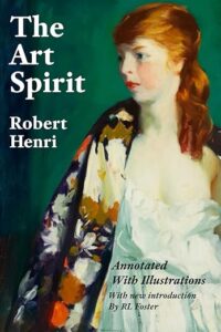 The Art Spirit by Robert Henri
"Art when really understood is the province of every human being." So begins The Art Spirit, the collected words, teachings, and wisdom of innovative artist and beloved teacher Robert Henri. Henri, who painted in the Realist style and was a founding member of the Ashcan School, was known for his belief in interactive nature of creativity and inspiration, and the enduring power of art.
Learn More
I still don’t understand. The bottom Trace of Black, Trace of Yellow, Trace of Red are all gradually darkened with black? So the trace of any color in the bottom section comes from the 5% row in the top section and is gradually darkened with black?
Good question Arthur.
The section using a trace amount of Black, Ochre, and Red is exactly the same mixtures as the upper half of the chart with the following changes:
• They are in inverse order, from light to dark
• The addition of a very small amount of Black, Ochre, or Red. The “trace” is the amount of color needed to slightly alter the basic mixture in the direction of the trace color.
These trace colors shift the saturation, brightness, and temperature of the resulting colors to a warmer or cooler hue. The exact amount of shift is where your artist’s judgment comes into play. Learning to control those attributes is the goal of this exercise.
The column of pure red cadmium; the first row, it’s pure red at 100 percent. Working it’s way down adding more white. Then gradually working its way darker in Inverse order. so the very bottom row at 100 percent is a mixture of pure red and a trace of yellow? This makes sense but for me this color is closer to the first row, 1y:2r column. I got a B on this assignment because my trace of yellow box doesn’t match yours. The only way I can fix this is adding black to the pure red column along with the trace of yellow. But the way this palette is explained, the pure red column and the last row at 100 percent, it should not be this dark. So question is… did you add black to the pure red column in the bottom row trace of yellow?
Hi, I have grid made up and paint at the ready however I need help with the bottom five rows. Are you able to clarify? I’m quite new to this and I just can’t figure it out! Than you, Louise
The section using a trace amount of Black, Ochre, and Red is exactly the same mixtures as the upper half of the chart with the following changes:
• They are in inverse order, from light to dark
• The addition of a very small amount of Black, Ochre, or Red. The “trace” is the amount of color needed to slightly alter the basic mixture in the direction of the trace color.
These trace colors shift the saturation, brightness, and temperature of the resulting colors to a warmer or cooler hue. The exact amount of shift is where your artist’s judgment comes into play. Learning to control those attributes is the goal of this exercise.
I am really enjoying mixing with the Zorn Palette and amazed at the beautiful colors it creates. I have one question, as I am using your limited palette grid heavily to check myself. When using your grid on the Pure Red all the way down to the bottom five tertiary colors, I am not sure how starting with 100% red and adding a trace of yellow can make the color you are suggesting? On the pure color with a trace of yellow, I get a much more red color, as I would expect. What am I missiing?
Hi Michael! I am pretty new to painting and found this page on the Zorn Palette. I made one of the grids according to your plan above and it worked out great. I am really glad you put in the tip about mixing the paint and then making multiple puddles in which to add your tint and then trace. I can see it would have been much tougher if I had done it by mixing one square at a time. It was a lot easier to see the differences in the values the way you suggested which made it a success. Thanks! 🙂
Peter, I’m so happy that you have found this tutorial helpful. I made the world of difference to my understanding of color and the power of a simple palette
Hi Michael. I just received my print of the Zorn Palette and I was disappointed with the quality of the print. What I wanted was a good colour print that I could copy based on your instructions above, so that I could make my own palette. What I received though was a print of what seems to be low quality pixels of the colour image. When I compare the actual chart with what you present here, the colours on the chart are more muted and pixelated. Is there any chance I can send this back and receive a refund? I think it would be better for me to create my own chart based on the images from the computer. Please know that I love your work. Thank you.
Rick, I am so sorry you’re not happy with your print. For a full refund, you can return it to FineArtAmerica.com, for any reason, within 30 days of the order date. As soon as they receive it, they’ll issue a full refund for the entire purchase price. Please note – Fine Art America does not reimburse the outgoing or return shipping charges unless the return is due to a defect in quality.
You can call FineArtAmerica.com any time (24/7) at 877-807-5901 for details.
Happy painting ~ Michael
Great article! I will definitely experiment with this. I am a wildlife artist but I found myself needing this palette for the face of apes! Love your swatch sheet, will use it for sure! The question I have though would relate to the use of Cad Red. It was only patented in like the last year of Zorn’s life, do you think he would have used something older like vermilion or another red?
Chantal, good question. I agree that Zorn probably used Vermillion. I use Cad Red as a personal preference. I’m sure substituting Vermillion for the Cad Red would give great results as well.
Can you please explain the percentages and what they are in relation to on the bottom half of the palette? Thank you so much for your help!
Hi Natalie. The percentages refer to the ratio of a given color mixture to white. The first row contains pure color mixtures (100%) without white. The second row has 3 parts (75%) color mixture plus 1 part (25%) white and so forth. The 5% row has predominantly white with a small amount of the color mixture. The rows in the bottom half have the same ratios of color mixture to white at the top half with the addition of a trace of a third color. In essence, the upper half of the chart contains a limited-pallette version of primary colors (yellow, red, and blue) and secondary colors (oranges, greens, and violets). The lower half contains a representation of tertiary color (browns and grays). I hope that helps.
When mixing colors, especially for color charts, it is much easier to start with the lightest tint and continue to add the darker color until the sequence is finished. You just need a very little bit of the darker color, usually. Unless you are very experienced with mixing colors, doing the opposite will often result in huge piles of the final tint as you find you need to add more and more white to lighten the base color enough.
Thank you so much for your insight Martin. I also find dividing the base color/mixture into five piles before adding white to each helps control the amount of paint used. Mixing and adjusting all the values for a single base give the artist an opportunity to be sure that the graduation of values is properly balance before applying them to the grid.
I recently discovered Spinel Black, which is somewhat cooler than Ivory Black. It would be interesting to see the results with Spinel. I did one painting using this palette (although I used Vermilion instead of cad red) with beautiful results. It’s amazing how harmonious the hues are with such a limited palette and how it’s virtually impossible to paint a wrong note anywhere, as the mixes all have some pigment in common.
I have never used Spinel Black. Gamblin claims that Spinel Black is a “truly neutral black”. It would be interesting to see how yellow ochre shifts when mixed with Spinel black. What I like about playing with a limited palette is discovering the nuanced colors and temperatures when using different “primary” colors. You are so right, John – the beauty of a limited palette is the wonderful color harmony. It is the magic of simplicity.
Bruce Marsh asks why some painters have a large number of colors in their palettes. One reason is that some colors cannot be mixed from other color combinations. For example, Blue Shade Phthalo Green (PG7) cannot be mixed from any blue and yellow pigment combinations, so if a painter wants that particular green, he must use that pigment. Some other examples, which I call “primary pigments” as opposed to “primary colors”, are Indian Yellow (PY83), Quinacridone Magenta (PR122), Indanthrone Blue (PB60), and Transparent Red Iron Oxide (PR101). These may be approximated, and such approximations may work beautifully and satisfy the artist’s particular need, especially when the basic principle of color proximity is considered. Two other factors are cost–mixing earth tones from primaries is more expensive than buying the ready-made siennas, umbers, etc.–and the fact that many artists do not care to mix extensively either due to lack of training or the time needed, and prefer to work directly with the “ready-made” color. Of course, color may not be the dominant factor in a work, and in such cases a limited palette might be most desirable. It should be added that many artists do accomplish fabulous work with limited color palettes, and that is an art in itself.
So, where it says Trace of Yellow and Trace of Red, we are to understand it to mean Trace of Yellow and black and Trace of Red and Black?
Similar question – because that is what the colors on Michael’s sample palette seem to be! My column 5 looks very different — because it does not include black. Michael can you please clarify? Thank you!
Actually I wonder if maybe Michael made the same mistake I did at first, including a trace of black in column 5? Columns 6-12 have black in them already!
Hi Vanessa. Good question and good analysis. You sound like you have a clear understanding of the spirit of this exercise. Good catch about the trace amount of black in column 5. I did add a trace amount of black there to see what the tertiary color (the blending of all three colors) would look like in that column. As you point out, because black is already in columns 6-12, it’s not needed to create the tertiary colors in those columns.
I have enjoyed reading this article and the comments. I would enjoy following your blog.
Thank you so much for this article. I think the limited palette makes painting easier so you can focus on ligh and shadow and not worry so much about which color tube to use, you can just mix your own colors with a limited palette and create more harmony in the painting. Zorn was a great artist.
Zorn was an extremely interesting artist…but…to limit your palette to a few colors is to deny yourself the full range of colors possible!
I use a very limited palette, white, Ult.Marine Blue, Pthalo Blue, Cad Yellow medium, Cad Red light and Aliz Crimson. This gives the full spectrum, and full value range. I make all color choices based on the color wheel…Blue, Green, Yellow, Orang, Red, and Violet. I also make adjustments in value and saturation by thinking in these terms.
So my thinking is never about earth colors…I can make them easily and quickly with the spectrum above. I also can easily move a color warmer or cooler by thinking about which way I want to move it on the color wheel.
I’ve never understood why some painters use a great number of colors…they can be mixed from a few. Mixed colors always lose a bit of saturation…but my paintings depend on the colors I observe…in nature…which are always mixtures…never fully saturated. I will say that I do NOT paint sunsets.
Hi Michael,
I don’t quite follow your procedure for the lower five squares in each column.
For the columns containing only one pure tube colour (pure red, yellow or black), the trace colour added in the lower five squares is not actually a third colour, but only a second colour. Correct ? I.e. the first column contains pure yellow ochre, lightened by degrees with white in the next 4 squares. Then in the lower five squares, the leftover quantity of yellow ochre lightened with white is darkened by adding successive quantities of black. But since we only began with one colour (yellow ochre) the black being added is only the second colour in this mixture. Correct ?
Secondly, perhaps I’ve misunderstood the process, but in the pure red column, if white is added incrementally to end up with a pale neutralised reddish-white, and then in the lower five squares yellow is added to this pale, neutralised reddish white, how does this eventually create a near black ?
I’ve made additions in capital letters to your description below. I figure I must be misunderstanding something, so perhaps you could delete or correct my additions as appropriate:
“I added a trace of the color that was not mixed in upper half of the chart. So where Yellow Ochre and Red are mixed AND THEN LIGHTENED SUCCESSIVELY WITH WHITE, I added to trace of Ivory Black TO THE LIGHTEST MIXTURE, THE ONE CONTAINING THE GREATEST AMOUNT OF WHITE – enough to see a shift in saturation without overwhelming the original mixture. The idea here was to see what kind of color shift from warm to cool happens when a trace of the third color is added.”
“TIP 1: Mix One Column At A Time.
Mix a large puddle of pure colors first and divide it into five smaller puddles. Then add white to each puddle to create the gradually lighter mixes. After those colors are painted on the grid, add the third, trace color, to THE REMAINDER OF EACH mixture (WHICH WILL BE VERY PALE AND NEUTRALISED WITH WHITE) to use in the lower half of the column.
kind regards,
Benedict Moleta
I made a lengthy comment…but an error message says I already made it?? In brief…gotta have blue.
Hi Michael
I’m a South African painter, a fan of Degas and the like. For some reason I only recently found out about Zorn – great painter, and I’ll give the limited palette a go. Thanks for the info
I’m coming back to look again, got here by searching for zorn palette.
Great answer, I am going to do it for sure. Got the Schmid book too!
Zorn’s palette is sorely lacking in Blue! I use 6 colors…to cover the spectrum…Cad Yellow, Cad Red Light, Aliz Crimson, Ultramarine Blue, THalo Blue and Titanium White.
I am always amazed at painters who have a box of 10 or 20 colors…why??
Bruce.
I used blue black instead of ivory black and that helped with the blues.
Even with Ivory black the blue range will be VERY low in saturation…Zorn could never have painted the water stuff he did without a blue.
I really am committed to my palette. I always need to have a full spectrum available for any subject. I never use any earth colors…I think of every color I use and mix in terms of the primaries and secondaries….instead of yellow ochre I mix cad yellow with a touch of blue and red, to make a low saturated yellow.
Incidentally; your test of Zorn’s palette is impressive in terms of it’s careful execution!! I simply tried his palette to do a small painting, and the blues were sorely lacking!
In your color chart I see NO greens or blues or violets…tough to do any landscapes without these.
Bruce.
Extended palettes can be useful if they are rationally set out and applied. My first landscape mentor, Jerral Derryberry, introduced me to a palette which had, in addition to white, burnt umber and burnt sienna, a COOL and WARM hue of each of the eight primary and secondary hues. This palette is used to “play color temperature within general hue/value zones” — keeping the value of the zone but using color temperature to define the objects within the zone. It works wonderfully.
One thing which is very important when making any color swatch chart is to paint TWO charts, one as shown here, and another in which the swatches are cut out and a hole is punched in the middel of each swatch. Keep the punched-out part in a small plastic bag, labeled with the swatch identification from which it was punched. By overlaying the punched swatch, and also the punched-out “dot” over other swatches, you can get a good idea of how the different colors interact in combination. Especially in a limited palette like Zorn’s, this is the key to being able to make neutralized hues appear more saturated than the do alone.
Another way this exercise can be extended is to experiment with transparent versions of the opaque colors Titanium White and Cadmium Red Medium (Yelllow Ochre and Charcol Black are, respectively, semi-transparent and very transparent), and use them to make glazes and scumbles of the colors, extending the swatches. This can double the number of effects you can obtain from the limited palette.
Try to paint swatches with both transparent/transparent and opaque/transparent combinations. Glazing and scumbling are unfortunately often overlooked by most contemporary painters. To speed up the process use amber medium which can be glazed almost immediately after application. (I have been using both copal and amber mediums for over 15 years with NO change, despite the dire warnings of Ralph Mayer).
Beautifully written and simple to follow. Thank you! Now, I’m interested in knowing the brand of pigments you are using, as I’ve found some pretty wide differences say between….Gamblin and M Graham, etc. Thank you!
I forget to say if you do this exercise to paint first “colors straight out of the tube, either pure or mixed with another pigment” but after, start from the white to add the mixing colors.
I think it’s very important to start from the clearest to the darkest.
And you’ll use less colors.
Hello,
i’m a french painter (and teacher of art). Thank’ you for this information and this very good exercise (i have just finish it 😉
There is 25 years i’m working drawing and a few paintings. I know i’m a very bad colorist because i’m not good in gray scale (i usually start to work with yellow ocre and burnt sienna to give a sculptural construction, and after work with the colors: you can see an example of my painting work here:
http://peintures.blogs.laclasse.com/2012/10/30/histoire-dun-tableau/
and the final here:
http://peintures.blogs.laclasse.com/2013/05/05/ladjoint-de-direction/ )
I think i’m but better in drawing (i let you judge on my website:
http://art-borescences.pagesperso-orange.fr/ )
I hope this chart will help me to find a better harmony of colors. I think it’s very good to learn the construction directly by these values. I will try.
Thank’s a lot… and excuse me for my so bad english 😉
I hope you’ll understand what i’m trying to say 😉
When I was learning the ropes I was taught the Zorn palette was primarily a flesh palette and not to be thought as an all intensive color combination to paint everything.I think this is where the confusion comes from when people argue about what additional colors he was using. These colors will do do quite a bit and are very effective in painting variety of skin tones. The logic being to add a color to the palette when the situation arose.
Extremely interesting; I will try it! My color education was based on Alber’s Interaction of Color.
Very interesting post!! I am hugely interested in color, but my education was in Alber’s interaction of color, and I use a limited palette of primaries and a couple of secondaries.
Thank you to Michael and all responding participants.
I cannot wait to begin the experiment!
Excellent exercise. Thanks very much for sharing.
Hi
This is probably a silly question, but I’m confused as to how to do the bottom 5 rows (trace of black).
At bottom left, do you add a little black to pure yellow ochre?
Then do you gradually lighten this with white to create the four colours above this/vertically?
etc
Thanks
Hi Leeann,
Yes, you are exactly right. The lower section gives you the value and hue range when all three colors are mixed. The result, of course, is a very subtle and harmonious range of hues and values. Lovely.
I really love this exercise, I’m doing it with mars black instead of ivory so the ochres are really lovely and green.
The bottom rows are the trickiest for me, I can get them desaturated but getting the right amount of black mixed in so the value shift is even/consistent is a challenge! I think I’ll get better as I go along (only finished the first set of 10 rows).
Thanks!
Alexis
Very interesting. Thanks Michael.
Thanks…Now I can Paint!!
Thanks Michael. Very well explained. I must try that one.
Great job on this post. Thank you for a very useful learning tool. I love the Zorn palette.
Zsoffencs:
Thanks for the clarification on Titanium, and on Zorn’s palette in that image. Thanks also for the generalized view on pigment choices of that era. Very instructive!
I am puzzled by Green “Cinnabar”, but your Boston link shed some light. Interesting…
Hi, at first let me say some words about titanium white. Titanium white was discovered in 1906, but it was patented in 1916. The first artist who used titanium white was Hans Arp in 1924… (based on the result of scientific examinations)
My opinion is that titanium white is absolutely wrong identification about the white color used by Zorn… Please look around here if you are interested in details about titanium white: http://cameo.mfa.org/materials/record.asp?key=2170&subkey=9394&Search=Search&MaterialName=titanium+white&submit.x=0&submit.y=0
Go back to the palette. At first we need to clear the question of limited colors. Let me describe the colors on the palette from left to right. (On the bottom) left: Prussian blue (Fe) as dark greenish blue (maybe this color was sold under the name of Antwerp blue (Prussian blue and Cobalt blue) http://cameo.mfa.org/materials/record.asp?key=2170&subkey=655&Search=Search&MaterialName=antwerp+blue&submit.x=0&submit.y=0 ). On the corner you can see dark ochre as iron oxide ochre natural (Fe). The next color should be vermillion (HgS) or cadmium orange (CdS). Than yellow ochre (Fe), cadmium yellow (CdS) and lead white (basic lead Sulphate PbSO4). Than ivory black in the right corner. (one color must be mentioned at least; it is a kind of red lake. this color was used to paint skin colors like roses on the face or the translucent brownish coat wearing by the lady. We have examined hundreds of paintings from the turn of the century from European art, it is one of the most common color on the paintings.)
Let me say some words about the relation of tube paints and limited palette at the turn of the century. Although we are talking about only few colors used by Zorn, let’s find out the components of olive green color. At the turn of the century the most common green color was Green Cinnabar, what is a special mixture of strontium chromate and Prussian blue. http://cameo.mfa.org/materials/record.asp?key=2170&subkey=9000&Search=Search&MaterialName=green+cinnabar&submit.x=0&submit.y=0 To get the olive shade lets mix this “green” with yellow ochre/cadmium yellow and a small pinch of ivory black and lead white. To get this olive green color 5 components must be mixed at least. (we mustn’t forget chrome green color what should be the 6th!)
Hello-
I came here from a google on “alla prima”, originally from research on Haddon Sundblom.
In my research, I also have come across the statement that the “attributing Zorn to this palette would be a mistake.” I think I found a useful clue that tends to refute this comment. I think he reduced his colors to this minimum within his first twenty years of working. In a self-portait of his mid-thirties, he allows the viewer see (at least) his studio palette in this image:
http://upload.wikimedia.org/wikipedia/commons/b/ba/Sj%C3%A4lvportr%C3%A4tt_av_Anders_Zorn_1896.jpg
I found his arrangement instructive– notice the squirt of black above each main color, look at the dragged olives and ruddy browns at his board’s far left.
I am also surprised to read in several places, of Zorn’s white as Titanium. I was instructed that this formulation was the most recent white. More likely, wouldn’t Zorn’s have been Flake (Lead) White as Sargent used?
Thank you for your interest! We need at least 1-2 weeks the complett the research of colors. I will let you know all the results. (I also must ask the owner of the painting regarding the publication.) When the report is ready I send it to Michael Lynn Adams. It is said another painting of Zorn need to be examined soon from his late period. It will be a very interesting/usefull research to compare the palettes from his different periods.
I’ll be very interested to know your point of you.
You can find a blog about our work here: http://art-crime.blogspot.com/2010/12/budapest-firm-tondo-examines-paintings.html
Zsoffencs, that’s interesting about the work done analyzing Zorn’s palette. Have the research results been posted online? I’d love to see them if so…
Great job, congratulation! We are dealing complex painting analysis in Budapest (Hungary); on the last month we got an artwork attributed to Zorn. Our job was to clear the age of the painting based on the colors, size of the pigment grains and the result of NDT analysis done by XRF (we also did xray, multispectral photos, etc…). All the colors you have mentioned are perfectly fit to his work; it was a painting from around 1890. He used vermillion, Viridian and cerulean blue (very little amount of prussian blue was also detected). Unfortunately I’m not allowed to send photos about the artwork but I can show you the result of sampling. It can be useful for artist I think. So, congratulation again for your work, it was a great help for us!
I would be very interested in seeing the results of the sampling if you can share them. There is significant disagreement – almost mythical – over the exact colors that Zorn used. The Zorn palette, or any limited palette, is a very interesting in that the limitations create new opportunities of expression.
Michael,
Great web site, and congratulations on your opening at Kwan Fong Gallery. I noticed you are a color chart enthusiast, and I thought I would pass along my web site in case you know someone with similar interests. http://www.colorfrontier.com I produce a set of blank chart boards that make charting a lot easier. I am not that easy to find on the web, however….. so, passing this along.
go to http://johnkilroy.com/navhub.htm to see a portrait done using a zorn palette by John Kilroy
Carol, yes there is a trace if Ivory Black in the lower five. Since I had combinations of the primary colors when they were paired I wanted to see the effect that a trace of the black would be since this pallette is more about the value of light and dark than color.
I hope you are having fun with this exercise. Happy painting.
HELP – I’m confused about the column of pure red. In the bottom 5 blocks, I’ve added the trace of yellow, and get a bright toned colour. Your colours look like there is black in them. Is there?
Carol MacDonald
Thank-you, thank-you for sharing this great exercise! Your instructions are wonderful, along with the photos.
I have just painted a rose with the Zorn palette named above. Although my structure was good, the rose turned out far too grayed and had no life. Bringing it back to life was a real challenge as I didn’t understand the possibilities of the mixed colours available. Had I known of this exercise first, I could have painted the rose with a lot more confidence, knowledge, and with greater speed.
You have inspired me 🙂
Looking at Zorn’s paintings I don’t see blue used, just a very light grayish blue that could easily be the Ivory Black and white mixed…amazing his rich colors with such a small palette!
Murat… That is the wonder of the Zorn pallette. Ivory Black is wonderful, cool black that tints other colors with a slightly blue tone. Ben’s comment gives you an additional hint at using black and a blue primary color.
Painting with this palette is challenging. A successful result is very harmonious and unified, but lacks truly saturated colors except for the red, of course.
I know it doesn’t follow the palette exactly but try a Cold Black or Blue Black (Don’t think Graham makes one but most other companies do). It adds a little extra coolness to the palette without adding a true blue.
Nice charts, and great description of the process. There is some question how much Zorn used this palette given he had a lot of tubes of Cobalt Blue in his studio at the time of his death. But, that’s neither here or there, I think this is a great exercise.
It’s interesting to note that Sorolla had tow completly different palettes, one for the studio and one for outdoors. Maybe Zorn did the same thing.
Wow…so you know what Sorollas outside pallette consisted of?
I’m interested in the outside pallet of Sorolla. Thanks!
This is really great! I may make my own charts. I’ve done the Schmid charts but am interested in expanding. It is interesting to compare the colors between artists’ charts, I would think.
Great information Michael. Thank you for sharing.