Painting How To
Step-by-step oil painting guide for Meyer Lemons
Meyer Lemons Oil Painting Guide
STEP 1: The setup
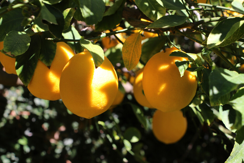
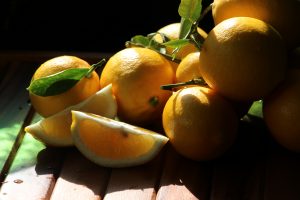
Meyer Lemons. They’re like regular lemons but have a warmer color and a sweeter taste. We picked these lemons, put them on a wooden tray, and lit them with the sun from our kitchen window. We were planning to make margaritas with their sweet and tart juice, but as usual, this moment inspired me to make art. I grabbed my camera and took a few shots. We did make the margaritas! They were absolutely delicious. In this step-by-step oil painting guide for Meyer Lemons, I’ll share my inspiration and the creative process behind this painting.
Goal: Celebration of light and texture
Before I start painting, I set a clear goal for what I want to convey. I wanted to show how the sunlight is captured and stored by these incredibly sweet Meyer Lemons. Throughout the process, I make sure to keep this main idea front and center, so I don’t miss anything or add anything that makes it unclear. Of course, the most important thing is to create a painting that’s as beautiful and captivating as the lemons were when I first saw them.
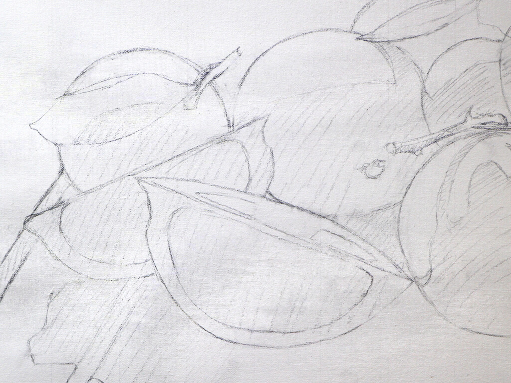
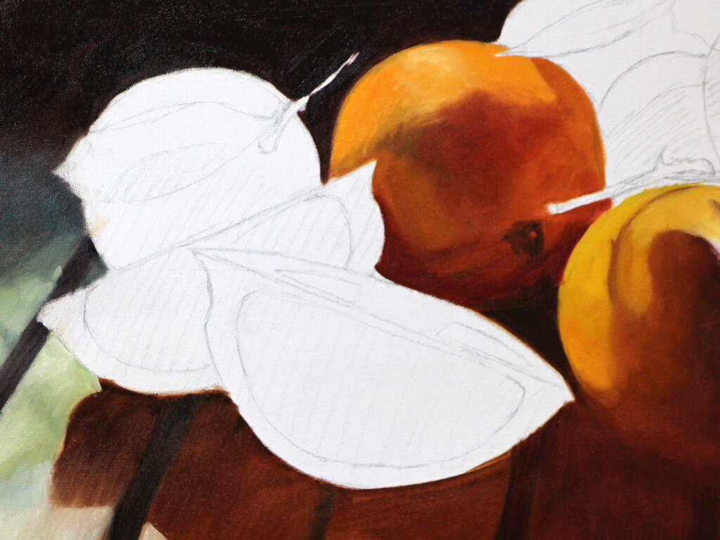
STEP 2: Drawing on canvas
Time to explore
I start by drawing directly on the canvas with a 3B pencil. Freehand drawing helps me figure out the composition and get to know the elements and how they relate to each other. I really pay attention to the rhythm, where the lemon slices are placed, and how they’re oriented. Once I’m happy with the drawing, I use a spray fix to make it stay put.
Freehand only – no tracing
Although I often use photographs for reference, I always draw my subjects freehand. I don’t like tracing because it makes the drawing look lifeless and doesn’t challenge me enough to really understand what I’m drawing. Freehand drawing also lets me explore and experiment with the composition. I can change the placement of the elements and get a better sense of how they relate to each other. I can also feel the rhythm of the placement and orientation of the elements – the directions they lean and how that rhythm creates interesting movement.
STEP 3: Blocking-in with Burnt Umber
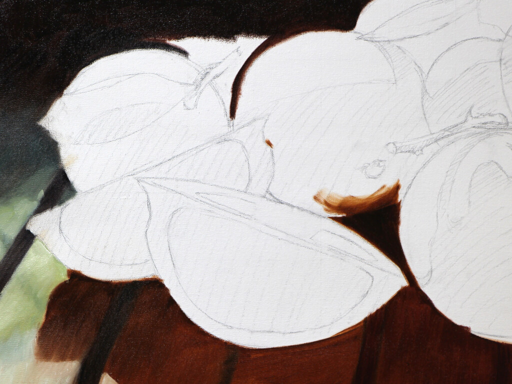
Focus on the large dark shapes
In the next step, I add some form and shadow to the drawing. For the background, I mix Alizarin Crimson and Ultramarine Blue to create a cool and dark effect. Then, I add warm light bouncing around the base of the lemons and paint the foreground shadow with Burnt Umber warmed with a small amount of Transparent Red Iron Oxide. It’s important to be careful not to over-saturate the warm color so it doesn’t clash with the colors of the fruit.
STEP 4: Block-in With More Color
Working from the background forward, I start by filling in the midtones. Then, I add a touch of the blue-green tint from the leaded glass window. This color, which is a nice match for the lemon’s colors, will make the lemon’s warmth pop.
STEP 5: Block-in complete

Block-in finished, now what?
With shapes, colors, and values in place, I create more interesting by adding middle tones, making the shadows darker, adding details, and adding highlights. The lemons are made with transitions of Cadmium Yellow Deep and Cadmium Orange. Their shadows are glazes of Transparent Red Iron Oxide and Alizarin Crimson; the highlights are cool gray tones. The cool grays make the yellows pop.
STEP 6: Finishing Detail
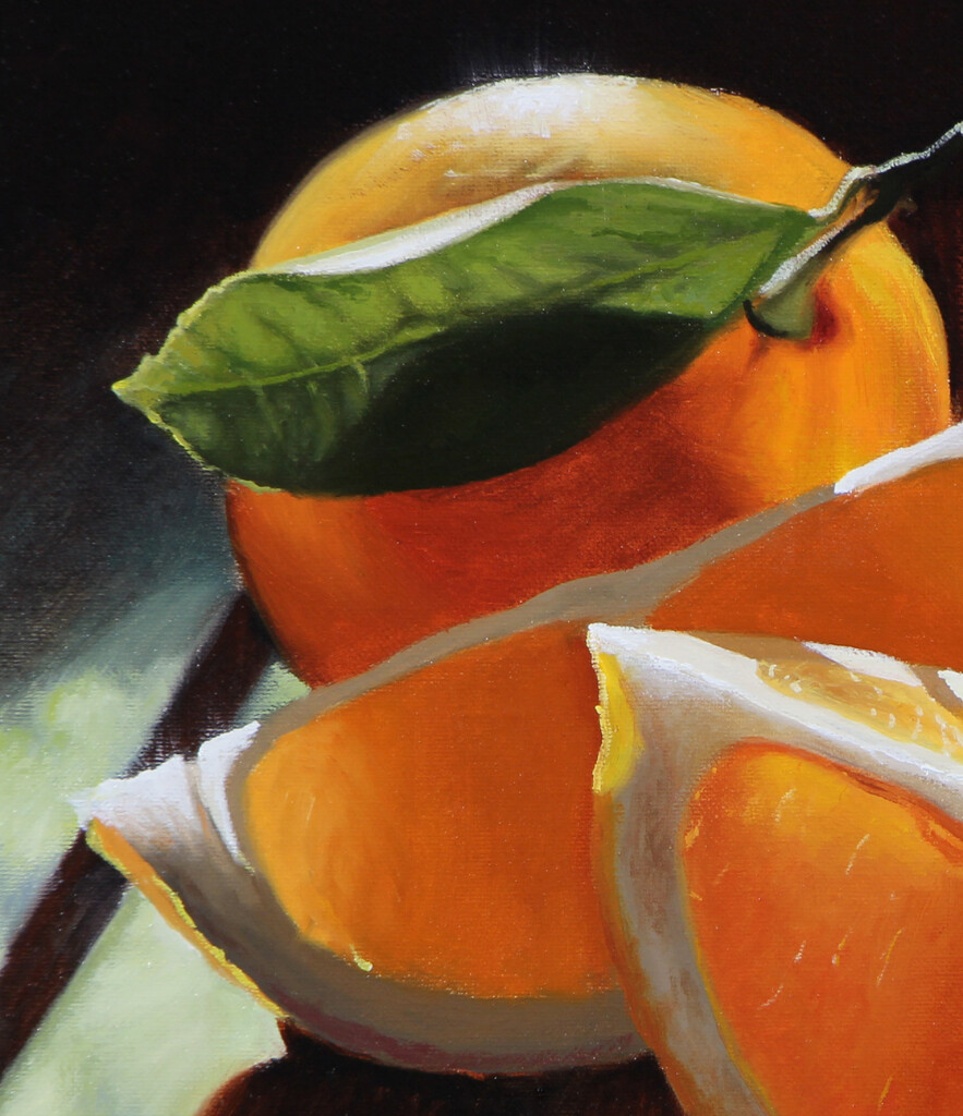
I’ve made some adjustments to the contrast between the background and foreground lemons. I’ve also increased the saturation of the background and pulp in the shadow. The most saturated areas are the light through the leaves and the light through the juicy lemon slices. I’ve used bright highlights sparingly. Thin lines of light green define the leaf edges, making them look 3D and thin. The juiciness of the fruit is enhanced by very thin highlights of white along the slice edges and a few of the lemon cells. The final touch is a quick vertical stroke over the wet highlights with a soft fan brush to add soft edges to highlights against the deepest background color.
STEP 7: Finish – my favorite part
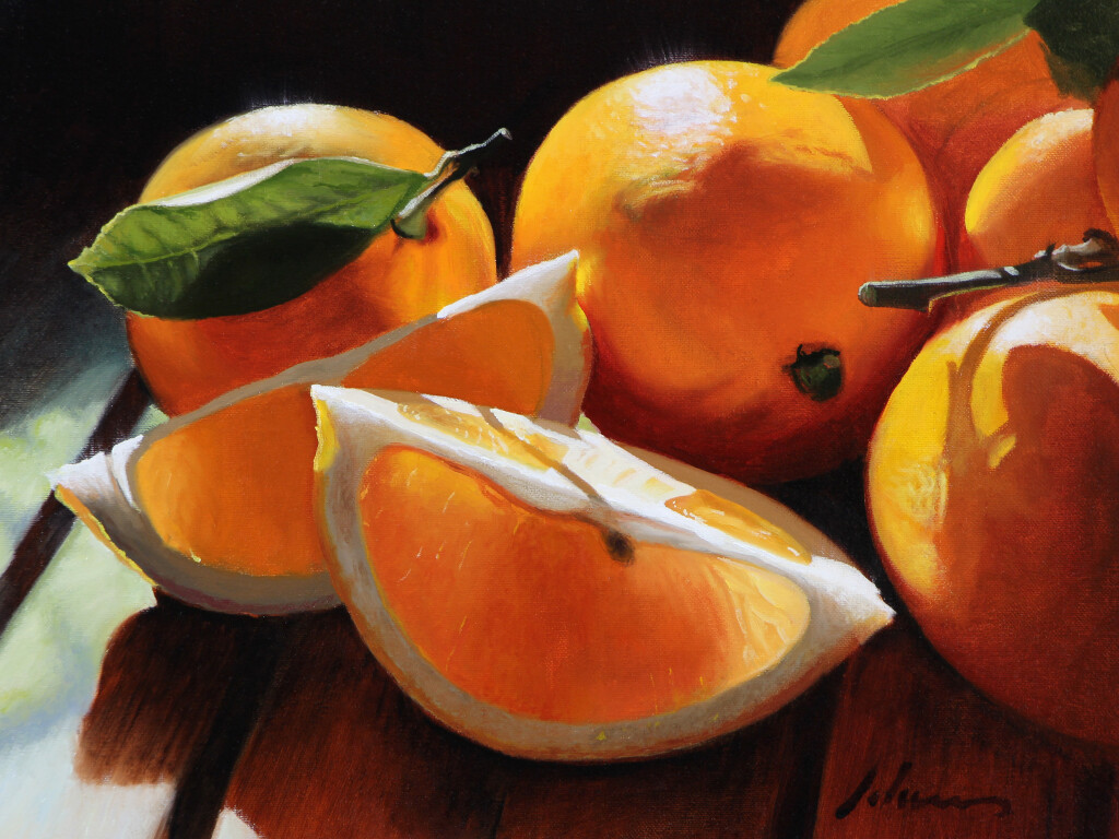
Refining through blending middle tones, deepening the shadows, adding details and highlights. Note that the highlights at this stage are not pure white. I only use pure – or close to pure – white as my final strokes.
Short video sequence to see how Meyer Lemons was created.
If this tutorial has been helpful, please like, share or subscribe.
Materials
Stretched Canvas – acrylic double primed
Paints (M Graham)
In the order arranged on my palette
M Graham Walnut Oil Paints
Alizarin Crimson
Cadmium Red
Cadmium Yellow Deep
Cadmium Orange
Cadmium Yellow Light
Titanium White (quick drying)
Veridian
Ultramarine Blue
Ivory Black
Varnish (for restoring color brilliance)
Blair Retouch Varnish
Medium
M Graham Walnut Alkyd Medium
Gamlin Aylkyd Gel Medium
Brushes
Rosemary and Co. Brushes
Evergreen Synthetic
Hogs hair bristle
Other Tools
4B Graphite Pencil
Kneaded Eraser
Metal ruler straight edge
Reducing Glass
Palette Knife (only for mixing)
Other Materials
Paper Towels
Turpenoid Natural
Master’s Brush Cleaner
FAVORITE BOOKS
Great instruction and wonderful inspiration for all level.
 Alla Prima II Everything I Know about Painting by Richard Schmid
This is my painting artist’s Bible. Icon Richard Schmid shares his wisdom and technical savvy, which came from a classical education and a lifetime of painting and teaching. The supreme alla prima master, Richard gracefully leads his reader through the subtleties of painting theory and technique with refreshing directness and unmatched technical authority. Richard's insights and lessons are not just valuable for alla prima painting, but for all styles.
Learn More
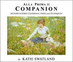 Alla Prima II Companion: Richard Schmid's Materials, Tools and Techniques
Richard Schmid's Materials, Tools and Techniques - By Katie Swatland. The path to creating great works of art begins with knowing the capabilities of your materials and tools.Contained within the pages of this book are detailed descriptions of the processes that go into the creation of a painting.
Learn More
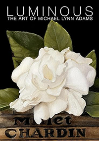 Luminous: The Art of Michael Lynn Adams
Painter Michael Lynn Adams explores how his childhood nurtured his artistic curiosity and shares methods for creating luminous works, illustrated with over 95 paintings and drawings.
Learn More
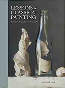 Lessons in Classical Painting: Essential Techniques from Inside the Atelier
 by Juliette Aristides
Lessons in Classical Painting presents aspiring artists with the fundamental skills and tools needed to master painting in the atelier style. With more than 25 years of experience in ateliers and as an art instructor, Aristides pairs personal examples and insights with theory, assignments, and demonstrations for readers, discussions of technical issues, and inspirational quotes.
Learn More
![]() The Art of Still Life
The Art of Still Life by Todd M. Casey
The Art of Still Life offers a comprehensive, contemporary approach to the subject that instructs artists on the foundation basics and advanced techniques they need for successful drawing and painting. In addition to Casey's stunning paintings, the work of over fifty past and present masters is included, so that the book is both a hardworking how-to manual and a visual treasure trove of some of the finest still life art throughout history and today.
Learn More
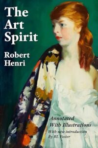 The Art Spirit by Robert Henri
"Art when really understood is the province of every human being." So begins The Art Spirit, the collected words, teachings, and wisdom of innovative artist and beloved teacher Robert Henri. Henri, who painted in the Realist style and was a founding member of the Ashcan School, was known for his belief in interactive nature of creativity and inspiration, and the enduring power of art.
Learn More
I like the way you described the painting simple step by step. As a beginner I found this most helpful. I personally would like more stills of say old cabins, etc simplified for the beginner.