Painting How To
Color Chart Exercise to Master Your Palette Fast
My life as an artist was at a crossroads
After three and a half decades as an art director, I was on the brink of a thrilling new adventure—embarking on a career as a professional oil painter. With a wealth of design experience under my belt, I had spent the last twenty years diving deep into the digital realm. My drawing skills were solid, but when it came to mixing oil paints, I was a bit of a novice. Despite my solid grasp of color theory, each oil color seemed to have its own quirky personality, making it a challenge to predict how they’d behave. I could envision the perfect hues in my mind’s eye, but translating them onto canvas often felt like a game of educated guesswork—and more times than not, I guessed wrong. This struggle chipped away at my confidence and almost put an end to my dream before it even took off.
 Richard Schmid’s book changed everything
That’s when I discovered Richard Schmid’s fantastic book on painting, Alla Prima – everything I know about painting. In his chapter on color, he describes this color chart exercise for oil paints his teacher, Bill Mosby, assigned it to his class. Most of Richard’s classmates dismissed the exercise as a boring waste of time. But Richard took it seriously, enjoying the challenge of executing it perfectly. It paid off for him. And, it really paid off for me.
This exercise accelerated my career
It took me several weeks to complete the twelve color mixing charts in this exercise (see the complete set of color chart exercise panels below). I not only learned how to mix colors, but also the nature of each color. Their staining power, transparency, temperature shifts when mixed, even drying times and how glossy or matte they dry. The confidence I gained with such thorough understanding of my palette helped to rapidly advance my painting skills. In less than two years, prestigious galleries were representing my work, and I had my first of many solo shows.
In doing the color chart exercise, care and patience truly pay off
There is power in the simplicity of this exercise. In a nutshell, you’ll mix all of the possible color pairs on your palette and chart out five different values (dark to light) of each mixture. Its power comes from careful execution and paying close attention to the way the paint behaves.
My finished panels on the studio wall. The thought of making them all is imposing, but I guarantee it is worth every minute. The more care you take in making them, the more you will be rewarded.
“It is the doing of the charts and the how they are done that matter.” ~ Richard Schmid”
To learn how to do anything in art requires doing the physical work. Just looking at the charts doesn’t come remotely close to teaching you what this color chart exercise has to offer. To get the most out of the exercise, pay close attention to what is happening:
- How a panel of various colors mixed with one predominant color creates a wonderfully harmonious color scheme.
- Which colors have strong staining power.
- How dark colors are hard to identify until white is added.
- The cooling effect of adding white.
- Mid-tone colors tend to be more vivid.
- Accuracy, not speed, is the friend of mixing the right color.
- The list goes on . . .
Alla Prima II – Everything I Know About Oil Painting
This exercise is the smallest sample of the riches in Richard Schmid’s Alla Prima. In my opinion, it is the best book available on the art and craft of oil painting. Richard gracefully leads you through the subtleties of painting theory and technique with refreshing directness and technical authority.
Let’s get started
In this tutorial I am using my 11-color palette. If you have a set of colors you are currently using, I encourage you to use them. Just keep the following in mind:
The number of panels you will need is equal to the number of colors on your palette plus one. In this tutorial, I am using an 11-color palette so I needed 12 panels.
You will be painting a series of 1″ squares separated by 1/4″. I used 8″x15″ panels for the job. If you have more than 11 colors you need to adjust the width accordingly. I used 1/8″ MDF primed with two layers of gesso, lightly sanded.
STEP 1: Draw the Grid
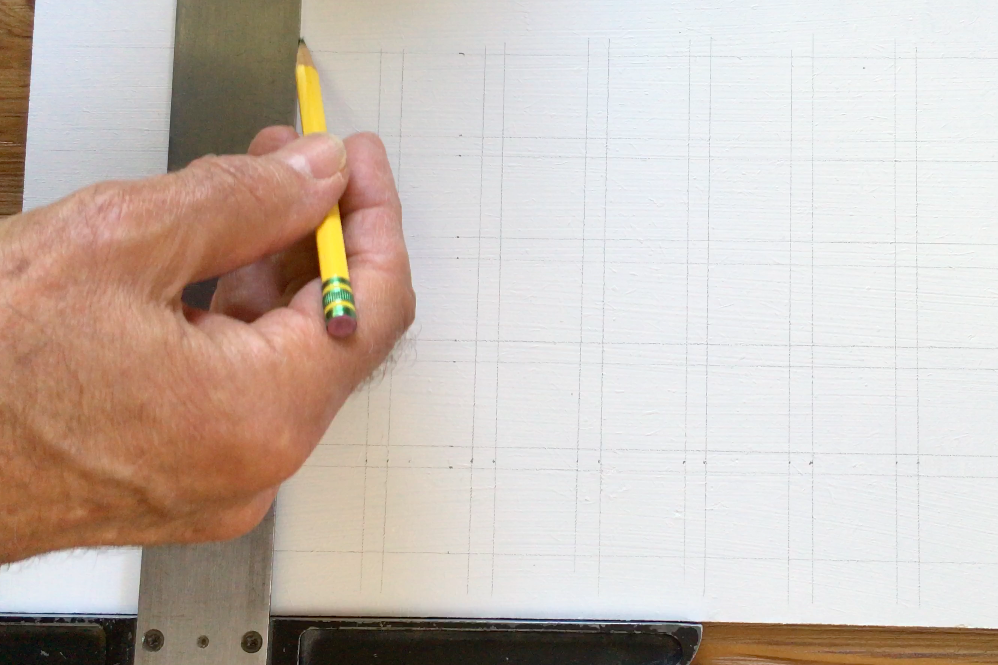
On a your panel, draw a grid of 1 inch squares with 1/4 inch space between them. 11 across and 5 down.
STEP 2: Mask the Grid
Using the drawn squares as your guide, apply 1/4″ house painter’s masking tape to mask the edges of the rows and columns.
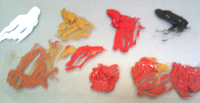
STEP 3: Mixing and Painting the Grid
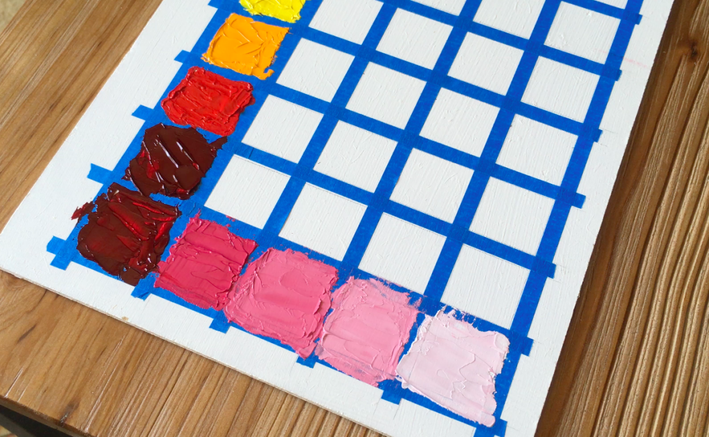
This is where the fun begins!
Using a small palette knife or brush, paint the grid with the colors mixed as follows.
TIP: Remove the tape before the paint dries completely. Removing it when it is dry is not pleasant. Attach new tape if you need to make corrections.
Your goal is to create five equally progressive stages of lighter values for each top row color. It’s not as easy as it sounds, but worth the effort.
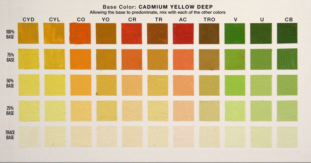
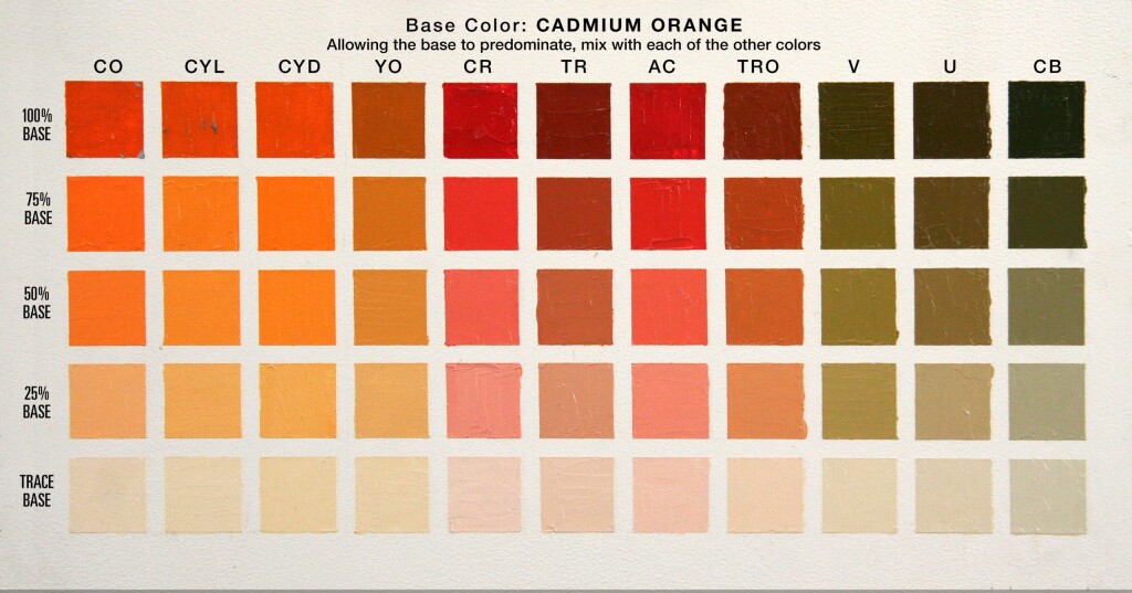
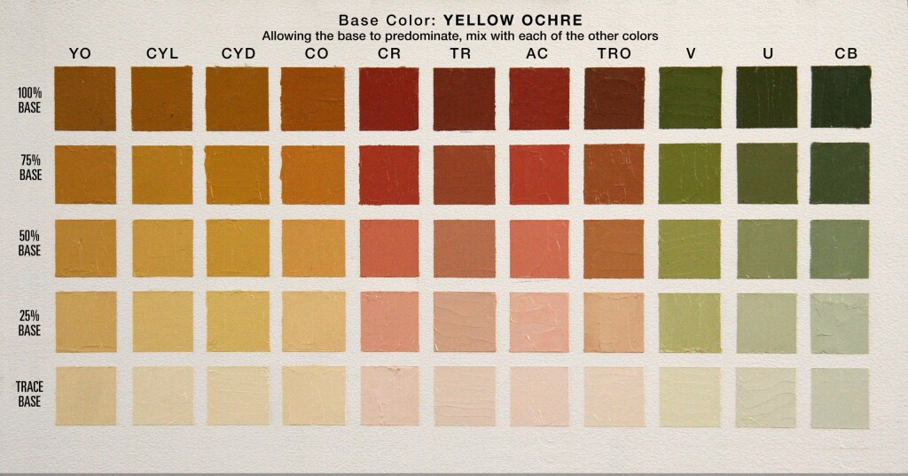
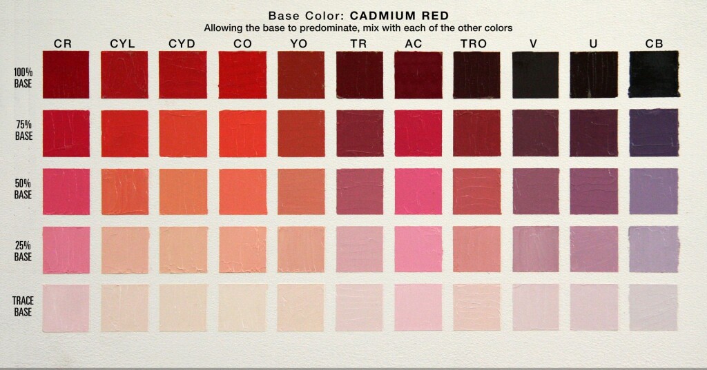
COLOR ROWS
TOP ROW – 100%
These are the BASE colors. They’re either a single color or mix of two colors straight out of the tube.
ROW 2 – 75%
Mix 3 parts BASE to 1 part white
ROW 3 – 50%
Mix 1 part BASE to 1 part white
ROW 4 – 25%
Mix 1 BASE to 3 parts white
BOTTOM ROW – TRACE
Mostly white with just enough color to shift to an off-white tint
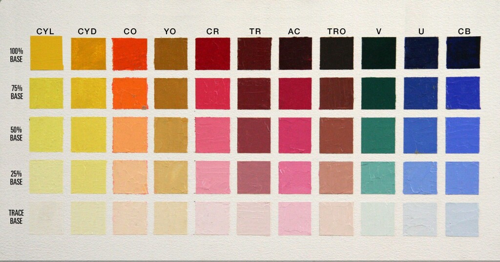
KEY
CYL: Cadmium Yellow Light
CYD: Cadmium Yellow Deep
CO: Cadmium Orange
YO: Yellow Ochre
CR: Cadmium Red
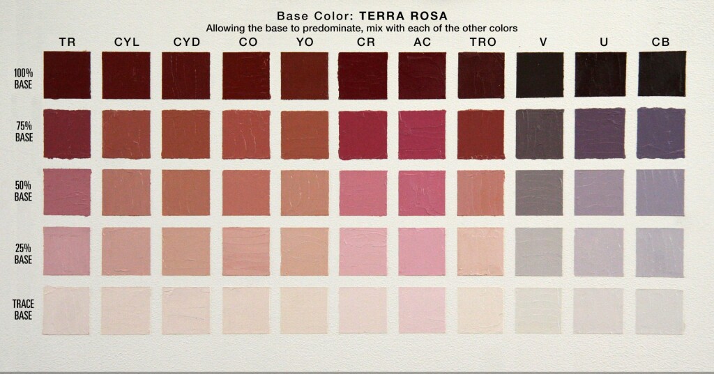
TR: Terra Rosa
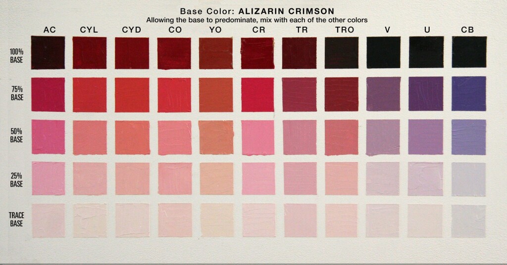
AC: Alizarin Crimson
TRO: Transparent Red Oxide
V: Veridian
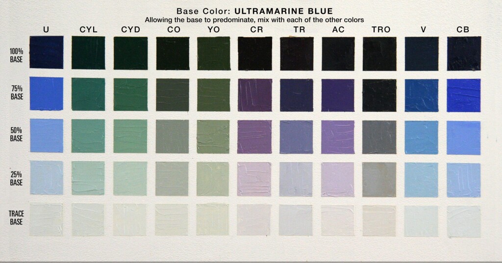
U: French Ultramarine Blue
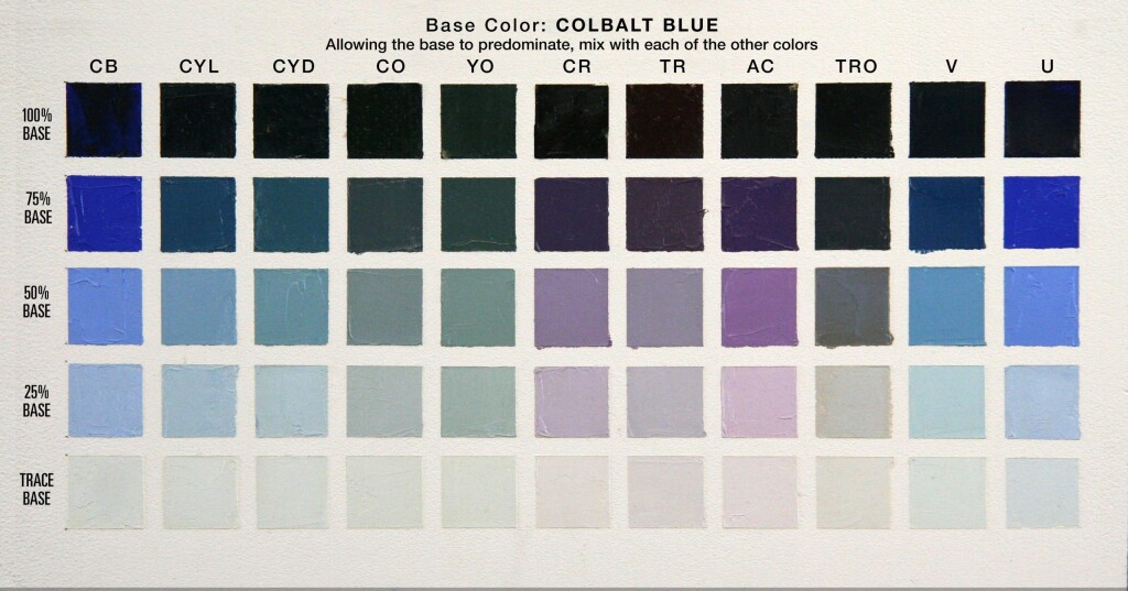
CB: Colbalt Blue
Titanium White is added to create values
I use M Graham oil paints. The base color will vary when using other brands.
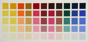
CHART ONE: Palette Colors
Top Row: Unmixed palette colors.
Lightening in Five Steps
This process is repeated on each chart
Each column is then lighted by adding white to the top row color. Your goal is to create five equal steps from 100% color to an off-white in the bottom row. The percentages in the margin are only suggested starting points. Depending on the staining power of the colors, you will need to adjust the ratio of white to the color. You will notice the mid-column, Terra Rosa (TR), got away from me a little, and I went too dark.
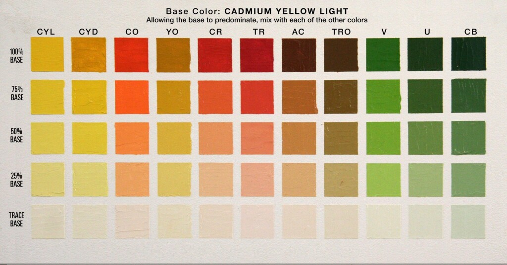
ALL OTHER CHARTS: Mixed Colors
TOP ROW: Signature Color plus palette color
For each of the remaining charts, the first column will be the palette color that will be the predominant color for that chart. In the case shown below, the predominant color is Viridian (V). Subsequent columns are mixtures of Viridian and the next color on your palette chart. In this case, the second column is a mixture of Cadmium Yellow Light (CYL) with Viridian predominating, the second column is Cadmium Yellow Deep with Viridian predominating, and so forth through to Cobalt Blue (CB). Avoid mixing equal amounts of each color, but enough color of the first signature color to predominate while allowing the other color’s character to be recognized.
Lightening in Five Steps
This process is repeated on each chart
Each column is then lighted by adding white to the top row color. Your goal is to create five equal steps from 100% color to an off-white in the bottom row. The percentages in the margin are only suggested starting points. Depending on the staining power of the colors, you will need to adjust the ratio of white to the color.
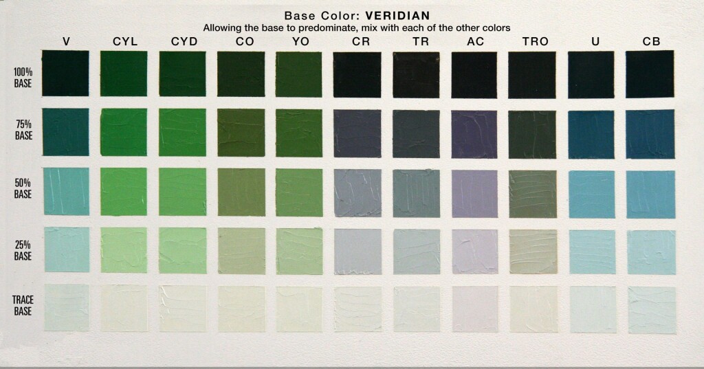
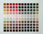
All of my charts, shown below, are for your reference.
PALETTE COLOR CHARTS
FAVORITE BOOKS
Great instruction and wonderful inspiration for all level.
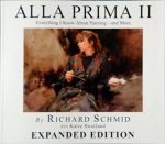 Alla Prima II Everything I Know about Painting by Richard Schmid
This is my painting artist’s Bible. Icon Richard Schmid shares his wisdom and technical savvy, which came from a classical education and a lifetime of painting and teaching. The supreme alla prima master, Richard gracefully leads his reader through the subtleties of painting theory and technique with refreshing directness and unmatched technical authority. Richard's insights and lessons are not just valuable for alla prima painting, but for all styles.
Learn More
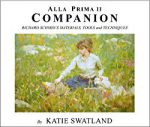 Alla Prima II Companion: Richard Schmid's Materials, Tools and Techniques
Richard Schmid's Materials, Tools and Techniques - By Katie Swatland. The path to creating great works of art begins with knowing the capabilities of your materials and tools.Contained within the pages of this book are detailed descriptions of the processes that go into the creation of a painting.
Learn More
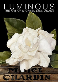 Luminous: The Art of Michael Lynn Adams
Painter Michael Lynn Adams explores how his childhood nurtured his artistic curiosity and shares methods for creating luminous works, illustrated with over 95 paintings and drawings.
Learn More
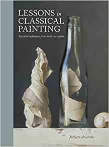 Lessons in Classical Painting: Essential Techniques from Inside the Atelier
 by Juliette Aristides
Lessons in Classical Painting presents aspiring artists with the fundamental skills and tools needed to master painting in the atelier style. With more than 25 years of experience in ateliers and as an art instructor, Aristides pairs personal examples and insights with theory, assignments, and demonstrations for readers, discussions of technical issues, and inspirational quotes.
Learn More
![]() The Art of Still Life
The Art of Still Life by Todd M. Casey
The Art of Still Life offers a comprehensive, contemporary approach to the subject that instructs artists on the foundation basics and advanced techniques they need for successful drawing and painting. In addition to Casey's stunning paintings, the work of over fifty past and present masters is included, so that the book is both a hardworking how-to manual and a visual treasure trove of some of the finest still life art throughout history and today.
Learn More
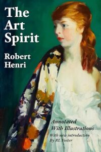 The Art Spirit by Robert Henri
"Art when really understood is the province of every human being." So begins The Art Spirit, the collected words, teachings, and wisdom of innovative artist and beloved teacher Robert Henri. Henri, who painted in the Realist style and was a founding member of the Ashcan School, was known for his belief in interactive nature of creativity and inspiration, and the enduring power of art.
Learn More
Pingback: Colour Harmony: Mastering Complementary Palettes in Painting – Drawings, Pet Portraits, by Iwona Przybylska
Pingback: Oil Painting Fundamentals
I tried ordering the color frontier charts and they are either out of stock or they are no longer in business. Do you know where I could purchase a set?
Thank you for this most helpful tutorial.
I have become fascinated by colour, and seeing the way the oil paints in my palette behave with each other in creating different colours.
I have both professional and student quality paints and I’m wondering about the quantities to use when I mix paints of different quality, in mixing two different colours and when creating the different values if the white I have is student grade. Can you advise on the ratio of professional quality to mix with student quality in creating colour charts?
Michael,
Thank you for posting this. I really struggle with color mixing. I have been aware of these kinds of color charts for a while, I just need to take the time (and paint) to actually do them. But, I have a question: These are all combinations of two colors (plus white), but often times you need to mix 3 or 4 colors to get the correct color you need, right? Can you mix any color you would need with just these 2-color combinations of these colors? Thanks!
I strongly encourage you do this full palette exercise and try to be very exacting with color and values. Many of your questions about mixing more than two colors will be answered by doing this exercise. That’s because many of the tubed colors on your palette are already secondary colors (mixtures of two colors). For example, orange is a mixture of yellow and red; green a mix of yellow and blue; etc. Any of the earth tones such as burnt umber or yellow ochre are already tertiary colors (mixtures of all three primary colors). As you do this exercise you will learn which colors mixtures look very much like colors straight out of the tube. So, do this exercise rather than unstructured experimentation. It will save you massive amounts of time and frustration.
If you are interested in an very helpful approach to color mixing, Chris, I encourage check out Andrew Tischler’s YouTube video, “How to Mix Color” https://youtu.be/A1RdRqsRadI
Happy painting, Chris.
Hi! I studied painting in college eons ago (25+ year) and have painted sporadically. I didn’t have any color theory, the approach was “paint what you feel” – I want to reboot by undertaking these exercises. However I noticed you don’t have any earth tones, umbers/siennas, in your list other than yellow ochre. Do you recommend not using those colors for these charts?
If you are used to using the earth tones when you paint, by all means, use them in this exercise. You can make some beautiful earth tones with the palette as described in this exercise, too. Look at the Cadmium Orange panel where you will find one of the best base colors for flesh tones created by mixing Cad Orange and Viridian. The only earth tone I have on my palette is Burnt Umber, which I use primarily for blocking in values on my underpainting – but that is my personal preference.
Hi Michael,
What a great post and thank you for putting my book in such good company!
🙂
Todd
What a wonderful surprise to hear from you. Thank you for writing such a wonderful book on still life painting. You have written exactly the book I hope someone would write, and done it masterfully. It’s a work that very much belongs in the company of Juliette’s, and Richard’s.
Hi Michael thank you for this information. I am a beginner and wonder what colors should I use for the exercise? I don’t have my own preferred palette yet but I do have many paints inherited from another oil painters estate. Does brand matter?
thank you
Kelli
Your choice of colors for your palette will change as you grow as an artist. I’d start with the palette used in this demo:
Cadmium Yellow Light
Cadmium Yellow Deep
Cadmium Orange
Yellow Ochre
Cadmium Red
Terra Rosa
Alizarin Crimson
Transparent Red Oxide
Veridian
French Ultramarine Blue
Colbalt Blue
As for brands, I recommend you use a professional grade paint. Often, the color named on the label will not match with another brand. As a beginner you should get used to the look, feel and qualities of a single brand. That said, as you gain experience, you might experiment with other brands. I use M Graham oils. I explain why in here: https://michaellynnadams.com/i-love-m-graham-oil-paints/
Other excellent brands are:
Michael Harding
Rembrandt
Gamblin
Vasari
Happy painting, Kelli
Hi Michael.
Just a quick note, you didn’t change the link to Richard’s Website on the one lower down the page. It still goes to Amazon.
Thank you for catching that, Lesley.
The Richard Schmid book … everything and more is worth the investment as it will cause you to think about and assimilate what he says. It can only improve your approach to learning color and painting overall.
Thanks for your article . There’s a much easier way to carte your palette using the product from ColorFrontier – and it’s endorsed by Richard Schmid !
Colorfrontier.com ,
Randal McClure’s product looks like a real-time-saver but not for this exercise. Unfortunately, the Color Frontier pre-prepared boards only offer an 11-column grid. This Zorn Palette exercise requires a 12-column grid. ~ Michael
For those who are doing the Full Palette Exercise, I would absolutely recommend this product https://www.colorfrontier.com/
Hi, I’ve just read the wonderful article re Zorn palette on Jackson’s website. Fascinating, can’t wait to try it. I’ve just looked at Richard Schmidt’s book online – Alla Prima and it’s very expensive; is it worth it in your opinion?
Many thanks
Hi Trish ~
NOTE: After receiving your comment I looked for a better source for the book than Amazon. You can purchase “Alla Prima II” directly from Richard for $95 (softcover) plus shipping, at https://www.richardschmid.com/Alla-Prima-II-By-Richard-Schmid-p/skuap.htm – I have also changed the link in the blog text.
I absolutely think Richard Schmid’s “Alla Prima” is worth the investment. Of and dozens of art books in my library I feel the “Alla Prima” is the one I have learned the most from, and is the one I, by far, treasure the most. Let me explain. Richard’s gift of creating marvelous paintings is matched by his beautiful ability to make his experience of painting accessible and personal. This is evidenced by the caliber of the artists who view him as both mentor and friend. Among them are some of my friends and artist colleagues, Jeremy Lipking, Tony Pro, Alexey Steele, Michelle Dunaway, and Aaron Westerberg, and many many more. Richard wrote his book focused is on alla prima and plein air painting, but the lessons in it, both technical and from his life as an artist, are universal. Although he and I paint representationally, our techniques and final painting are very different.
Thank you for this, I’ll look into purchasing
Hi Micheal,
Thank you so much for sharing this excercise I did the Zorn one last year and it really was so helpful. Im preparing to do this one tomorrow and I just wanted to check on “V”. Did you mean Veridian ( as I think you do) or did you mean Vermillion as its written here in your personal initial list of base colours?
Thank you, Jenny, for catching my error. The “V” in my color does stand for Veridian. I will fix it right away.
Hi Micheal,
Thank you so much for sharing this excercise I did the Zorn one last year and it really was so helpful. Im preparing to do this one tomorrow and I just wanted to check on “V”. Did you mean Veridian ( as I think you do) or did you mean Vermillion as its written here in your personal initial list of base colours?
Great website ! Love the technical information as well as stories. Also the honest encouragement. Keep up the excellent work Michael !
Thank you for this tutorial. Cole theory has been one of my biggest drawbacks! Hopefully this will help. I have owned the book for years but never did the exercise
I did this exercise when I was reading Richard Schmidt’s book a few years ago and it was one of the best things I’ve done to advance my work. Highly recommend!
Thank you for recommending this exercise. I plan to do it. Should one add any medium to your paints or just use out of the tube?
More info please
Pam, I really want this tutorial to be helpful. What seem incomplete or unclear? Thank you..
Can this also be done in acrylic
Absolutely, Linda. I have done a similar exercise with watercolor, too. It is such a good way to learn the nature of your paints, which is really critical to color mixing. Happy painting!
I’m tackling this exercise very soon. I need more control and planning of colour in my paintings. Thank you for your tutorial.
Your welcome. This exercise sounds right for you. Don’t rush it. If you feel like a break to paint, do it for a while then get back to the exercise. You won’t regret taking the time. Happy Painting!
Hi Michael….Thank you for this tutorial!! For health reasons I have been away from my art for a couple of years and this tutorial has given me inspiration to get back to it. Thank you!
I am so happy that you feel ready to get back to creating art Jill. This exercise is a great way to ease yourself back into a routine. Be patient with it and enjoy the challenges and great benefits. Happy painting!!!