Painting How To
Crystal Gazing and a Limited Palette
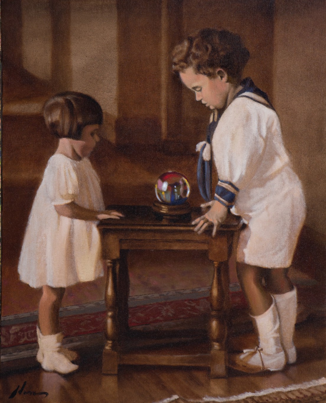
Before I get to the limited palette, let me give you a little background for this painting. Going through old family photographs recently inspired me to reinterpret them in paint. It has become a special way to reconnect to some really wonderful people. For example, here is my aunt Lois, we called her Lolo, and my father, Richard, in 1927. They were Americans both born in Paris, France, during the 1920s when my grandfather, Lewis Adams, was studying architecture in Paris at the École des Beaux Arts. Grandpa became a very successful architect with his office in New York City, my father a theater arts professor in California, and founder of several influential local and national arts organizations. Lolo was an accomplished pastel artist in Maine.
I love this photo, which was probably taken by my grandfather. The kids look so sweet all dressed in white. Two-year-old Lolo in her pretty dress, and four-year-old Dad in his sailor suit. But scuffed and dirty shoes give away his mischievous nature. You know he couldn’t wait to get out of the suit and back playing in the dirt.
I wanted to add a little fantasy to this image, and this is the story of what I did.
What is a Limited Palette?
A limited palette refers to when an artist paints with just a few colors rather than a more common array of more than a dozen. Swedish master Anders Zorn (1860-1920) is famous for his use of a palette limited to four colors – red, yellow ochre, white, and ivory black. (You can learn more about Zorn and his palette in this article I wrote a while back.)
Why use a limited palette?
- Painting with harmonious colors becomes easier.
- It trains you to think primarily in terms of value, the relative lightness and darkness of colors.
- This is crucial because we use relative values far more than color to perceive and comprehend the world.
- It also allows you to enjoy the challenge of creating interesting paintings without relying on brilliant color.
- My personal choice—because it’s fun!
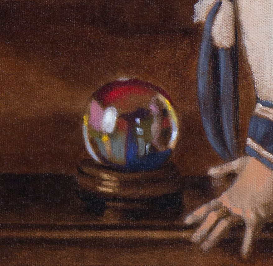
Using a limited palette for this painting simply made sense. Not because it was based on a 90-year-old black-and-white photo. Because I love to imply a story in my figurative paintings, and I wanted to add fun and fantasy to a muted environment by contrasting it with a few small sparks of rich color in the crystal ball. So I reduced my regular palette of fourteen colors to five colors: Burnt Umber, Cadmium Red, Yellow Ochre, Ivory Black, and White. OK. Seven. For the crystal ball, I added the tiniest bit of Ultramarine Blue and Cadmium Yellow.
Here is a quick step-by-step on how this painting was created:
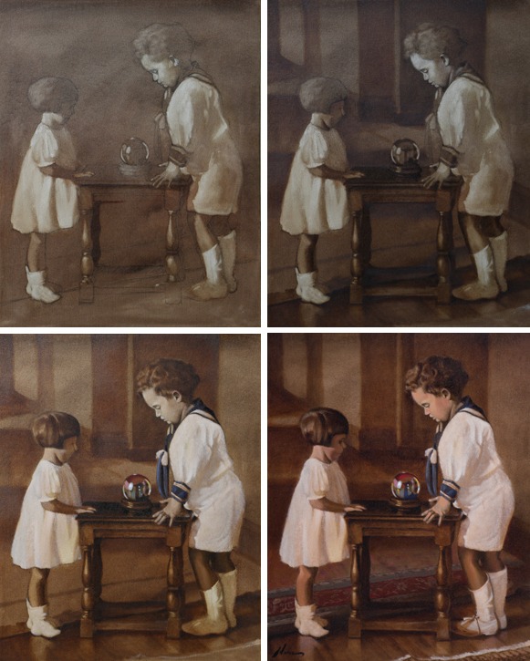
Underdrawing, Tone and Lift– upper left image
Following my normal practice, I made a relatively detailed freehand drawing directly on a primed canvas. I used a soft 2B pencil for the drawing, which I sprayed with a light coat of retouch varnish to keep from smearing as I continued to work the surface of the painting. In a few minutes, the varnish was dry. I then spread Burnt Umber thinned with fast-drying medium (no mineral spirits) over the entire surface. Using paper towels, Q-tips, and dry brushes, I scrubbed off and blotted the Burnt Umber to create the underpainting. That technique is called lifting.
Establishing the Darks – upper right image
Painting in the darkest darks with burnt umber, I focused on the shadows under objects, making them appear more anchored to the surface they stand on. With the other darks areas, they created a rhythm of dark and light shapes that dance to create interest and lead the eye around the painting.
Refining and Details– lower left image
Details were then added along with refining edges and building up the lights. I kept the paint thin and transparent, which adds a little more energy to the color. (Sorry, photographs don’t capture the effect of transparent colors very well.) I love transparent colors, especially when the shadows contrast by a more opaque handling of the light areas and highlights. I used a scumble technique for building up thin layers of tinted white paint applied with a very dry brush with a light, random motion. The highlights are created with larger amounts of paint brushed on in deliberate single strokes or dabs.
Color, Details, and Tints– lower right image and below
I then focused on detail and a final balance within the painting by looking for areas that just didn’t work and correcting them, whether it was the drawing, value, color, or brushwork. Once satisfied, I set the painting aside for a couple of weeks to allow it to dry. When dry to the touch, with color liberally thinned with medium, I applied a thin layer of warm tint to the flesh tones and some blue tint to my father’s uniform. I also added stronger reds, blues, and yellows straight from the tube to the crystal ball to give it a stronger punch of bright color.
Finished:
Crystal Gazing
20×16 inches | oil on canvas
Please let me know what you think.
If you like this post or have questions or comments, please let me know below.
FAVORITE BOOKS
Great instruction and wonderful inspiration for all level.
 Alla Prima II Everything I Know about Painting by Richard Schmid
This is my painting artist’s Bible. Icon Richard Schmid shares his wisdom and technical savvy, which came from a classical education and a lifetime of painting and teaching. The supreme alla prima master, Richard gracefully leads his reader through the subtleties of painting theory and technique with refreshing directness and unmatched technical authority. Richard's insights and lessons are not just valuable for alla prima painting, but for all styles.
Learn More
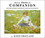 Alla Prima II Companion: Richard Schmid's Materials, Tools and Techniques
Richard Schmid's Materials, Tools and Techniques - By Katie Swatland. The path to creating great works of art begins with knowing the capabilities of your materials and tools.Contained within the pages of this book are detailed descriptions of the processes that go into the creation of a painting.
Learn More
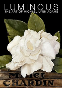 Luminous: The Art of Michael Lynn Adams
Painter Michael Lynn Adams explores how his childhood nurtured his artistic curiosity and shares methods for creating luminous works, illustrated with over 95 paintings and drawings.
Learn More
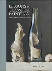 Lessons in Classical Painting: Essential Techniques from Inside the Atelier
 by Juliette Aristides
Lessons in Classical Painting presents aspiring artists with the fundamental skills and tools needed to master painting in the atelier style. With more than 25 years of experience in ateliers and as an art instructor, Aristides pairs personal examples and insights with theory, assignments, and demonstrations for readers, discussions of technical issues, and inspirational quotes.
Learn More
![]() The Art of Still Life
The Art of Still Life by Todd M. Casey
The Art of Still Life offers a comprehensive, contemporary approach to the subject that instructs artists on the foundation basics and advanced techniques they need for successful drawing and painting. In addition to Casey's stunning paintings, the work of over fifty past and present masters is included, so that the book is both a hardworking how-to manual and a visual treasure trove of some of the finest still life art throughout history and today.
Learn More
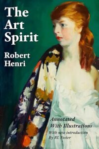 The Art Spirit by Robert Henri
"Art when really understood is the province of every human being." So begins The Art Spirit, the collected words, teachings, and wisdom of innovative artist and beloved teacher Robert Henri. Henri, who painted in the Realist style and was a founding member of the Ashcan School, was known for his belief in interactive nature of creativity and inspiration, and the enduring power of art.
Learn More
Michael,
I love the idea of using old B&W photos to create a painting, and it makes sense to use a Zorn palette for that. Thanks for sharing your process, very helpful to new oil painters like myself.
Your welcome. I really like using a limited palette. I use it often on early stages of my paintings because in if forces me to think in terms of light and dark values unencumbered by color mixing.